

Websit
e
s
Websit
e
s
DISCOVER WEB INTERFACES, RESPONSIVE DESIGNS, UX STRATEGIES & VISUAL SYSTEMS!


PROJECT & ROLE
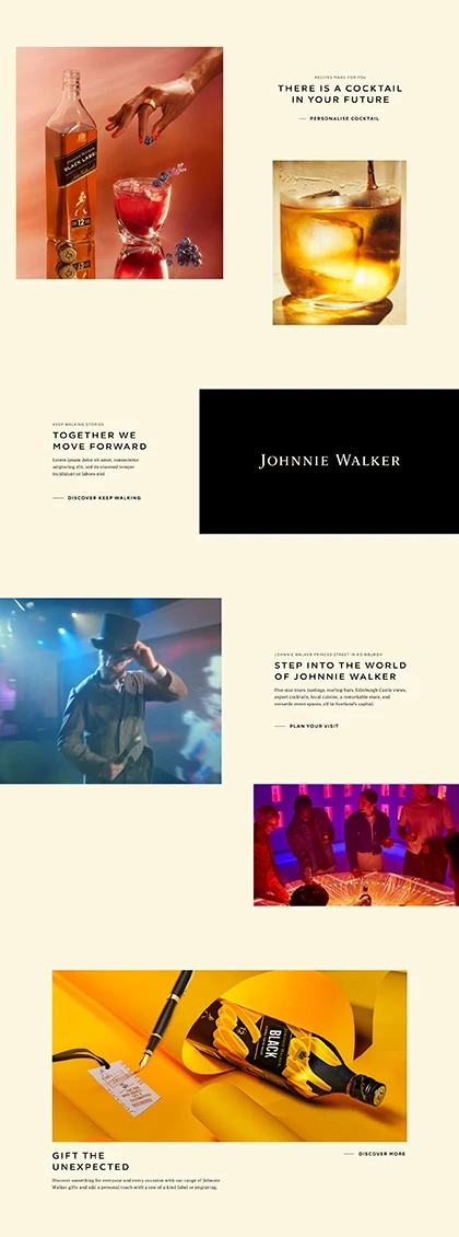
Over time, Johnnie Walker’s brand essence was diluted by fragmented website updates, resulting in a disjointed digital presence. They needed an interim solution to explore design directions and restore clarity and cohesion.
PROCESS
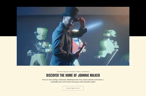
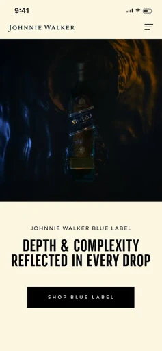
We explored styles for key modules, starting with the header, focusing on an immersive video to draw users into the Johnnie Walker world. Smooth transitions were designed to enhance the journey, create a seamless, engaging experience and reintroduce the core brand manifesto:
"Keep Walking".
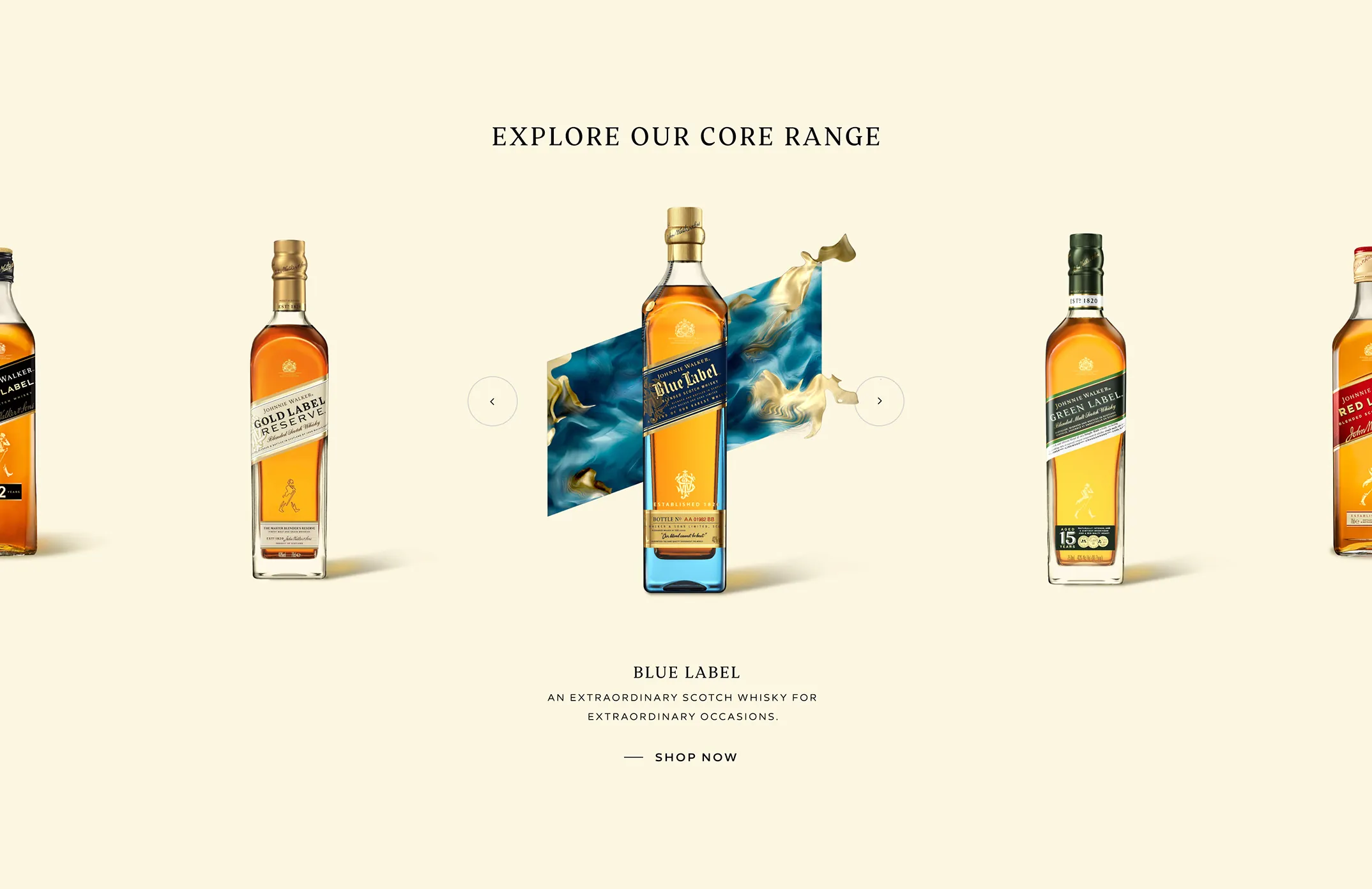
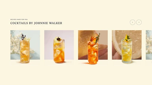
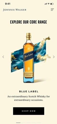
Carousels provided an excellent opportunity to spotlight the iconic Johnnie Walker bottle and their cocktail recipes while showcasing the brand's distinctive motion principles for each product. This dynamic approach brought the brand's story to life, emphasising its elegance and forward momentum.
Smaller details, like Johnnie Walker's "Keep Walking" mantra, were brought to life through the use of motion in the product carousel.
This subtle yet impactful animation reinforced the brand's message of progress and momentum.
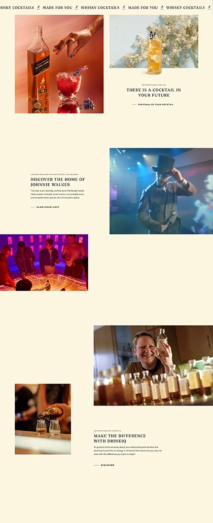
We explored various layouts to reintroduce light, space and a sense of visual rhythm, ensuring that each module flowed seamlessly into the next module. This approach created a cohesive and engaging user experience, emphasising balance and harmony across the site.
Pull-out modules allowed
us to break monotonous repetition and strategically highlight key offerings that Johnnie Walker wanted to draw users' attention to. These elements created moments of focus and discovery, aligning with
the brand's priorities, enhancing user traction
and engagement.
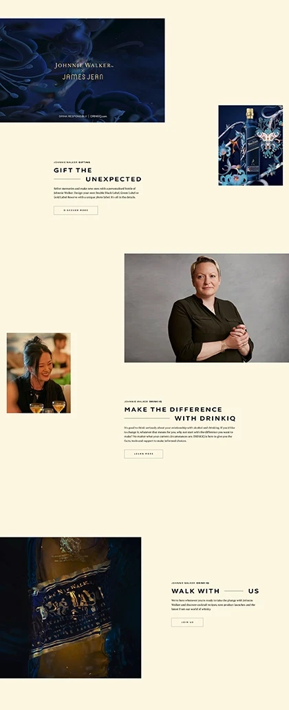
For the CTAs, we explored options that embodied the "Keep Walking" ideology while incorporating Johnnie Walker's latest expression, "Liquid Light." This combination created a cohesive visual and interactive language, seamlessly blending the brand's timeless mantra with its modern evolution.
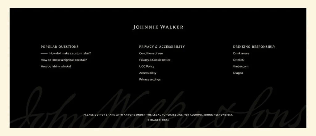
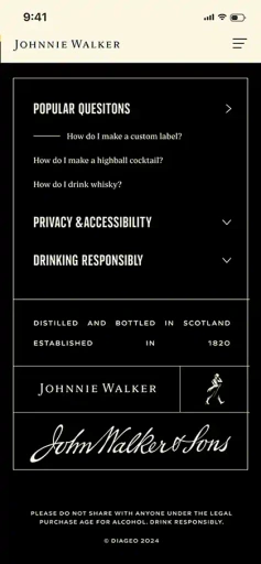
The footer presented an excellent opportunity to push the boundaries of creative thought. Drawing inspiration from the detailing on the product, particularly the label, we brought this to life with a dynamic write-on effect for the signature. This thoughtful touch added a sense of craftsmanship and authenticity, reinforcing the brand's premium identity.
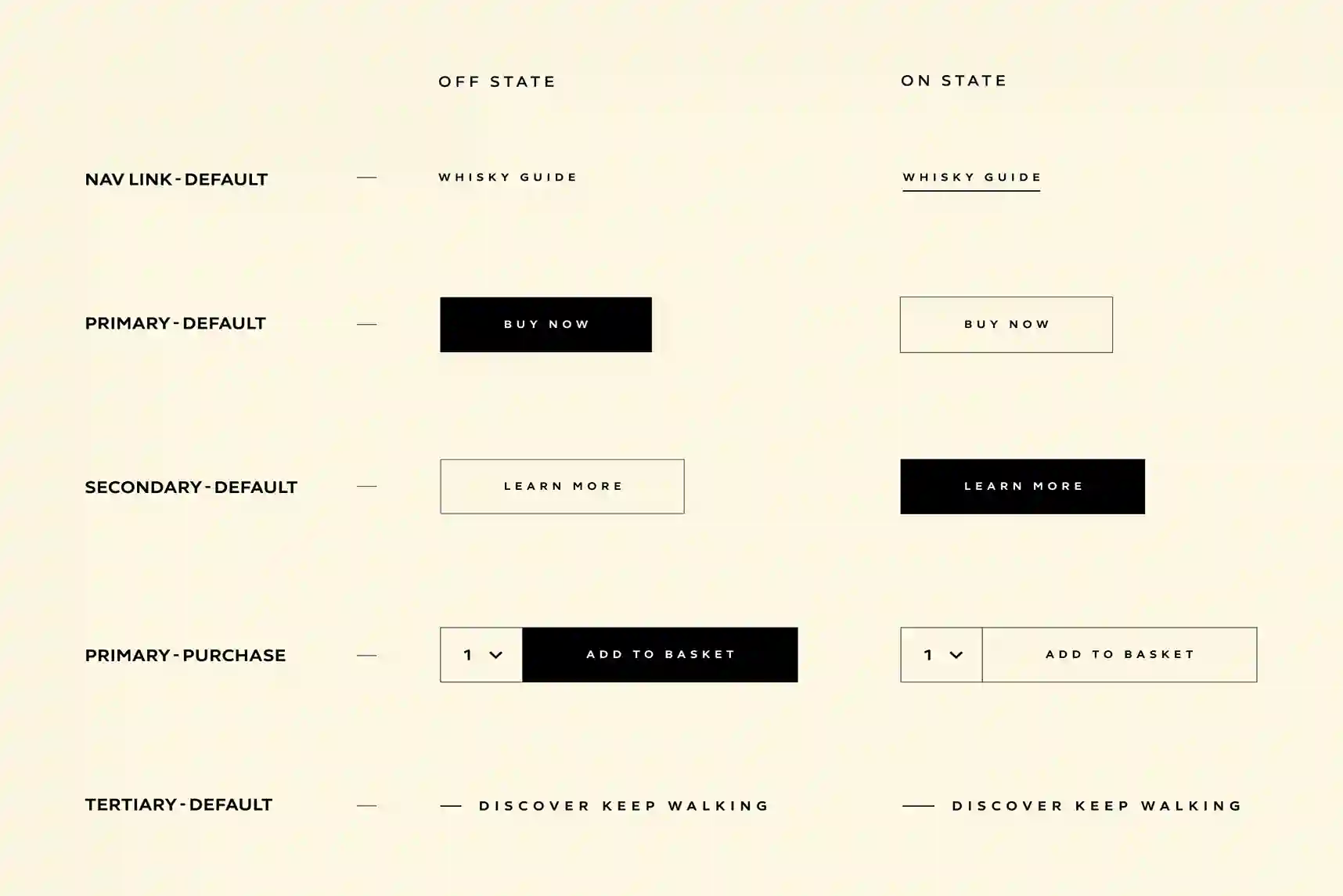
We used Figma to present our work, seamlessly transitioning from moodboards, insights, and brand explorations to clearly showcasing the finalised design routes for both desktop and mobile.
IMPACT
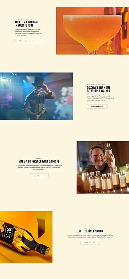
The interim rebrand of
the Johnnie Walker website
was well received by the client, clearly reflecting the brand’s manifesto and motion principles, often missed in standard rebrands and offering a bold contrast to the old design. I now await data to see how it performs…


Thank you!!!

JOHNNIE WALKER
THE PROJECT & ROLE
Over time, Johnnie Walker’s brand essence was diluted by fragmented website updates, resulting in a disjointed digital presence. They needed an interim solution to explore design directions and restore clarity and cohesion.
PROCESS
We explored styles for key modules, starting with the header, focusing on an immersive video to draw users into the Johnnie Walker world. Smooth transitions were designed to enhance the journey, create a seamless, engaging experience and reintroduce the core brand manifesto: "Keep Walking".
Carousels provided an excellent opportunity to spotlight the iconic Johnnie Walker bottle and their cocktail recipes while showcasing the brand's distinctive motion principles for each product. This dynamic approach brought the brand's story to life, emphasising its elegance and forward momentum.
Smaller details, like Johnnie Walker's "Keep Walking" mantra, were brought to life through the use of motion in the product carousel. This subtle yet impactful animation reinforced the brand's message of progress and momentum.
We explored various layouts to reintroduce light, space and a sense of visual rhythm, ensuring that each module flowed seamlessly into the next module. This approach created a cohesive and engaging user experience, emphasising balance and harmony across the site.


Pull-out modules allowed us to break monotonous repetition and strategically highlight key offerings that Johnnie Walker wanted to draw users' attention to. These elements created moments of focus and discovery, aligning with the brand's priorities, enhancing user traction
and engagement.
For the CTAs, we explored options that embodied the "Keep Walking" ideology while incorporating Johnnie Walker's latest expression, "Liquid Light." This combination created a cohesive visual and interactive language, seamlessly blending the brand's timeless mantra with its modern evolution.
The footer presented an excellent opportunity to push the boundaries of creative thought. Drawing inspiration from the detailing on the product, particularly the label, we brought this to life with a dynamic write-on effect for the signature. This thoughtful touch added a sense of craftsmanship and authenticity, reinforcing the brand's premium identity.
We used Figma to present our work, seamlessly transitioning from moodboards, insights, and brand explorations to clearly showcasing the finalised design routes for both desktop and mobile.


BEFORE
AFTER
IMPACT
The interim rebrand of the Johnnie Walker website was well received by the client, clearly reflecting the brand’s manifesto and motion principles, often missed in standard rebrands and offering a bold contrast to the old design. I now await data to see how it performs…
Thank you!!!
Thank you!!!
